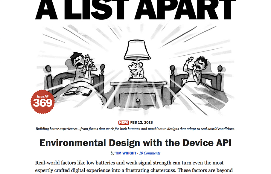
A very strong redesign by the fine folks at A List Apart. I love the focus on the articles, putting that front and center just brings home all the strategy they’ve been putting forth in the conferences and books. The minimal color palette works so well and helps the small spots of color really jump out at you when they need to use it. The other thing I really like is the gradation from big header, illustration and main story to a much busier and filled out grid layout with more content and links. Beautiful work.
Glassmorphism: The Transparent Design Trend That Refuses to Fade
Glassmorphism brings transparency, depth, and light back into modern UI. Learn how this “frosted glass” design trend enhances hierarchy, focus, and atmosphere, plus how to implement it in CSS responsibly.


0 Comments