
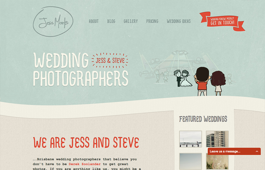
I love these colors, they feel so soft and welcoming and perfect for the subject matter. The little slideshow/animation of the scenes helps you understand really quickly what the site is all about if you don’t notice the large type “wedding photographers” – I mention this because it’s actually kind of easy to overlook that type. Weird.


Chunking: How to Design for a Brain That Can Only Hold Four Things
Your working memory holds about four things, not seven. Chunking groups loose information into meaningful units that slip past that limit, the psychology behind phone numbers, scannable pages, multi-step forms, and grouped navigation.


0 Comments