
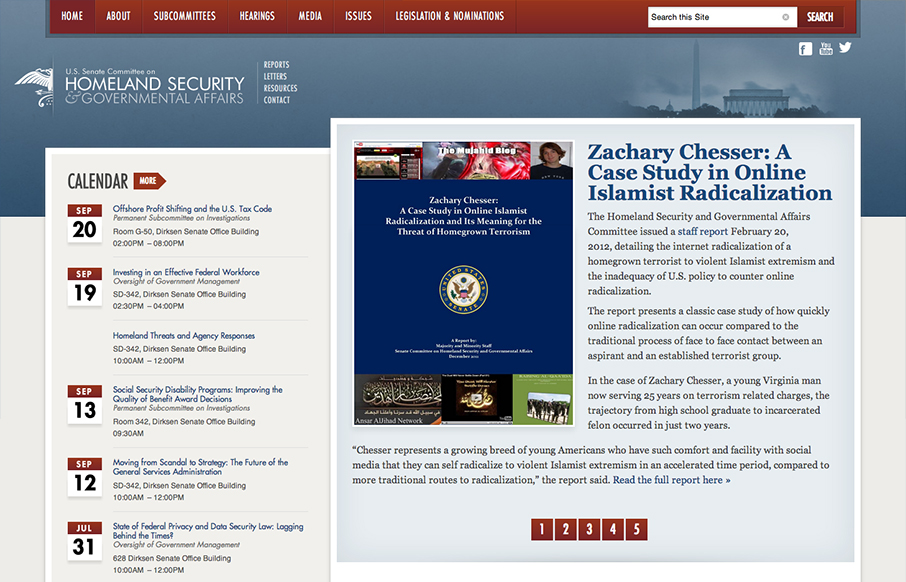
This responsive design for the Homeland Security site has some really nicely placed breakpoints. I really dig how the layout just really seems to flow so well in between the breakpoints too. Nice clean type and it seems really easy to use on a tablet and iPhone too.


Chunking: How to Design for a Brain That Can Only Hold Four Things
Your working memory holds about four things, not seven. Chunking groups loose information into meaningful units that slip past that limit, the psychology behind phone numbers, scannable pages, multi-step forms, and grouped navigation.


0 Comments