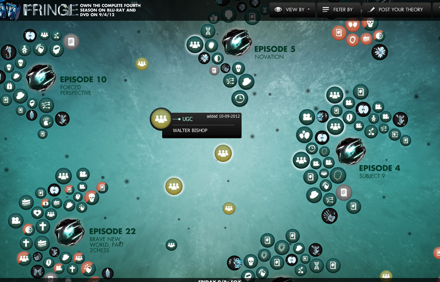
This is a super cool experiment in interactive exploration. It’s not entirely practical but it’s stuff like this that keeps us pushing what we think of as a typical website interaction and we always need that. It seems a bit outdated technically – cufon still being used it looks like so that likely dates it.
Glassmorphism: The Transparent Design Trend That Refuses to Fade
Glassmorphism brings transparency, depth, and light back into modern UI. Learn how this “frosted glass” design trend enhances hierarchy, focus, and atmosphere, plus how to implement it in CSS responsibly.


0 Comments