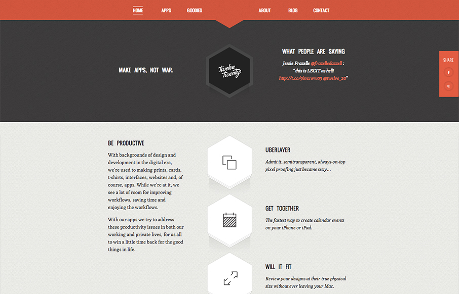
Really tightly designed website for Twelve Twenty. The little interactions that happen when you mouse over the icons are nice and keep you interested. The overall sharpness and minimal approach of the design mixed with limited color palette make it kind of stick out.


The Call to Action, Revisited
The Call to Action hasn’t changed in a decade, but the bar has. A fresh look at prominence, copy, mobile tap targets, and accessibility, with lessons from three major design systems.


0 Comments