
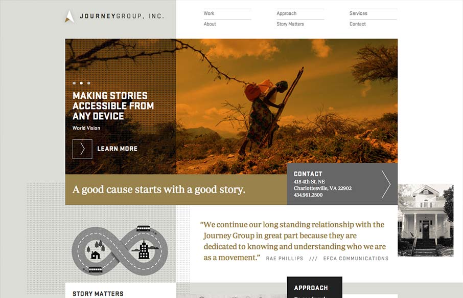
Order yet disorder. That’s how I like to think about this design. It starts off with this really strong grid feel and then the shapes and blocks of copy/images start to feel really asymmetrical and wonderful. I like the blocky vibe with the type and the flat colors give it a really nice upscale feel. It’s not fully responsive but I do dig the small screen size design here. Good work to review when you get a second or three.


Fitts’s Law: Why the Easy Button Wins
Large, close targets are faster to hit than small, distant ones, that’s Fitts’s Law. A look at the 1954 rule behind buttons, prime and magic pixels, thumb zones, and dark patterns.


0 Comments