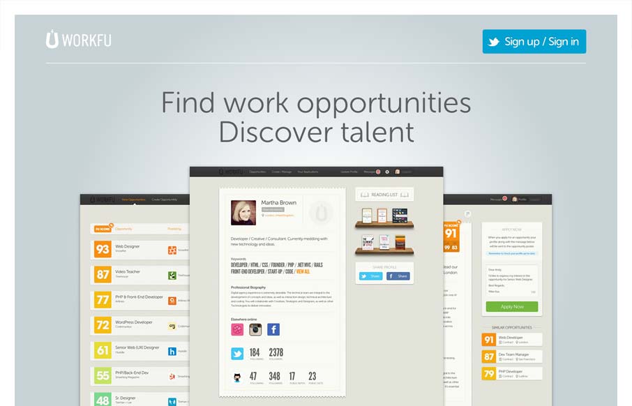
Really minimal product site design. I think the way they’re showing the product screens off is superb like this. I also like the way they’re treated as you size the screen down too. Super simple signup process too using twitter. I’d love to hear how that’s helped conversions if there is comparative data on a before and after of using twitter solely for signup/sign in.
Glassmorphism: The Transparent Design Trend That Refuses to Fade
Glassmorphism brings transparency, depth, and light back into modern UI. Learn how this “frosted glass” design trend enhances hierarchy, focus, and atmosphere, plus how to implement it in CSS responsibly.


0 Comments