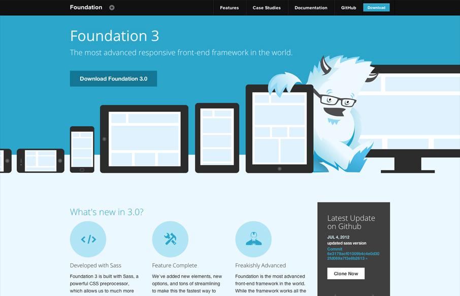
Zurb has given us many good things, Foundation is surely one of them. But they also design pretty solid websites to house the things they make. This site is great example of making a monochromatic color scheme work. The idea of using the yeti and the cool blues together gives the sense that things are cool here. The sharp vector illustration is carried through all the way down to the little tiny social media icons in the footer too – it all matches. Clearly the site would be built using the framework so you can poke through that all you like too. Overall there’s a grand lesson here on using great marketing/design to sell your open source project. This design blows me away, a lot of open source projects could take the advice Zurb is giving here.


Glassmorphism: The Transparent Design Trend That Refuses to Fade
Glassmorphism brings transparency, depth, and light back into modern UI. Learn how this “frosted glass” design trend enhances hierarchy, focus, and atmosphere, plus how to implement it in CSS responsibly.


0 Comments