

This beautiful site takes full advantage of responsive design to deliver a compelling visual experience at every resolution. The massive imagery is nicely offset by asymmetrical text and bold, hard-lined shapes. In my humble opinion, stry.us seems to look best at around 1200px, but all breakpoints make sense and keep the layout from ever looking too disjoint, as can often happen with poorly thought out responsive designs. Last, but not least, the stories are great.

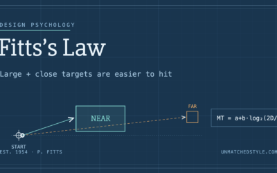
Fitts’s Law: Why the Easy Button Wins
Large, close targets are faster to hit than small, distant ones, that’s Fitts’s Law. A look at the 1954 rule behind buttons, prime and magic pixels, thumb zones, and dark patterns.

0 Comments