
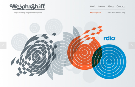
New Weightshift site design makes me happy. There’s such a simple artistry to this website, there always has been, but this newest responsive design is the best so far. The subdued colors make you focus squarely on the work first. Also the way things are named and presented by the copy/tone sells the brand of this design firm very well. Love it.


The Call to Action, Revisited
The Call to Action hasn’t changed in a decade, but the bar has. A fresh look at prominence, copy, mobile tap targets, and accessibility, with lessons from three major design systems.


0 Comments