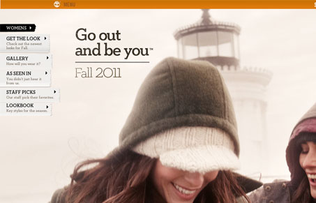
This website has a picturesque magazine feel that takes full advantage of the browser window. This “wide open” layout is really appropriate for the content and imagery; the winter landscapes and product portraits look great. Many of the interactions are animated and dynamic, which is nice; they do a good job of standing out from the imagery. Some of the transitions are a little hitchy in places, especially when it comes to resizing the browser, but I don’t think it detracts from the experience too much. The fluid layout accommodates most screen sizes (to a point) and the photography looks great, though I must say that I looked at image sizes and many of the pics are at or around 300k. Ouch!


Really love the large image use and the editorial (magazine) feel. I’m glad to see that they are not afraid to use large images in order to keep the integrity of what they are trying to represent. I honestly feel that criticism of large image sizes is unwarranted in this high-speed digital age. If this degrades nicely for mobile to exclude the background images in a responsive layout, then even better. Two thumbs up for putting beautiful images out there and not compromising on the quality/size.