
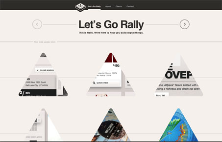
This site has it all. It’s beautifully designed, easy to use and technically impressive. The first thing you notice is the grid of triangles going down the page is that when you hover and click they smoothly transform into circles, each revealing data and links to dribbble screenshots. I like that they use dribbble as show off their work and the interactions are executed perfectly. I also enjoy the transitions between the different pages of the site. They are smoothly animated, quick, and the url updates without any hashbang messiness. The overall result is more like an app that a website and if you keep digging around you’ll see all sorts little details.




0 Comments