
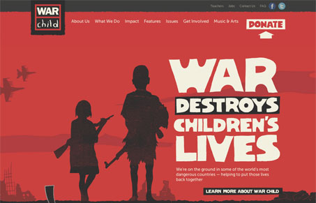
This design for warchild.org.uk is just an assault on your visual sense. The colors and style of the type and illustrations speak volumes about the subject matter – brining a great sense of humanity to the design to help tell the story viscerally as well as in straight forward copy. The website mostly feels like a giant and clickable info-graphic and I mean that in the highest complimentary sense I can suggest. Please watch our screen cast review and let us know what you think too?




0 Comments