
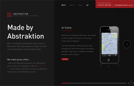
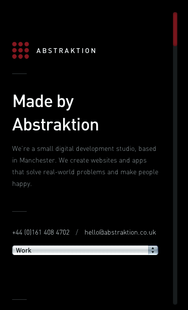
abstraktion.co.uk has a great minimalist style and is beautifully responsive. The design’s simple structure and typography hide a wealth of subtlety that gives the site a polish and sophistication often lacking in even most well designed sites. The subtle transitions on page load and the inclusion of keyboard commands great little additions as well. Top it off with friendly copy and you’ve got a compete design that says a lot about the people who put it together. The devil’s in the details.




0 Comments