
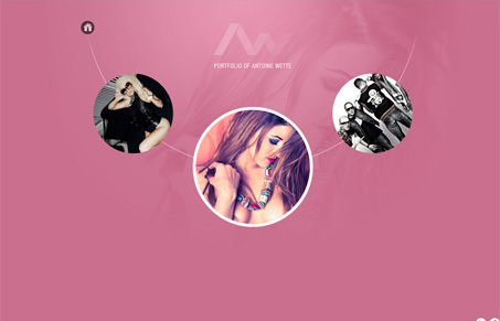
Interesting interactions on this website for sure. I dig that things are placed in circle like this, it gives it a really dynamic look. Some of the transformations the shapes make on interactive items when you use them are pretty slick and look great. One thing digs at me is that the navigation is pretty hidden, you have to know to click on the home icon to open it up. Which is confusing – why click on the home icon when I first load the site? I can’t help but be reminded of many flash based site’s i’ve seen over the years, the only real difference here is that this isn’t a flash site. It’s still pretty powerful visually.




This is a simple and gorgeous site but I feel that the design overshadows the content a bit. I agree, It is visually powerful but its the interaction that has the power, not the presentation of the portfolio pieces.
Still, its really nice. A beautiful site.