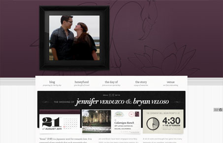
I’m late getting this design up in the gallery – wedding site by/for a super great web designer Bryan Veloso (@bryanveloso) of avalonstar.com. Look up his stuff, he’s great.
This wedding site is really great, I love the big picture (like in a real frame) in the top section – visually that’s just nice and very applicable here. I love the deep purple and swan drawing – I hope he used that theme throughout other wedding stuff. There’s just a nice hierarchy of info as you visually make your way from the top to the bottom of the home page. It’s picture first (what family and friends are there to see) then breaks down various points of info about the date as you scroll. Beautiful.
Congratulations Bryan & Jen!


0 Comments