
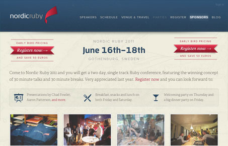
The Nordic Ruby Conference is back with an updated website this year. I love the design, responsive and also has a bit of interactive animated worked in. Lovely color palette and overall organization. I do think that the home page loses hierarchy on the content as you scroll down the page, everything feels the same weight and tone, it’s clear and easy to read which is like 75% there. Overall though the site is a beauty.




0 Comments