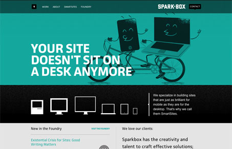
I love this Sparkbox website. The thing is it’s so complete in it’s message and positioning of the company that it makes me rethink projects i’m currently working on. It’s not often a site does that for me…
I love the colors, they’re grounded in this sort of fun feeling but it’s totally professional and badass at the same time. The individual pages are all working together but yet are different and full of content to keep you interested. I particularly love the ‘about’ page. That ‘footer madness’ stuff is just funny.
The website is also responsive, which you’d expect from a site for a team that specializes in mobile websites, but it’s also done very well. Go ahead size it around and see for yourself.


0 Comments