Found via:
By @beep: Enjoying the thoughtful (and responsive!) http://ribot.co.uk/ redesign.
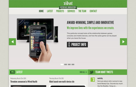
This site has a really great feel to it. I love the green and white/gray color scheme, It just feels particularly English to me (I have no idea what that really means…). I think the thing I like most, aside from it’s responsive design is the way the modularity of the design fits perfectly with it’s typography. It just all matches up so well. Then the logotype stands out kind of loudly because it’s so different.
Really great work on this site!


0 Comments