
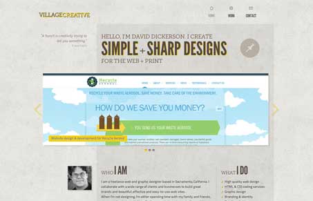
Really crafty looking layout in villagecreative.com. I love the asymmetrical layout and dynamic use of the grid. The background texture and colors are all chosen and executed well and the overall visual rhythm of the site is super nice. I’m never that hip to having a main navigation item like “contact” simply open up an email dialog, give me a form please. Overall though this site is simply well done and enjoyable to review.




0 Comments