
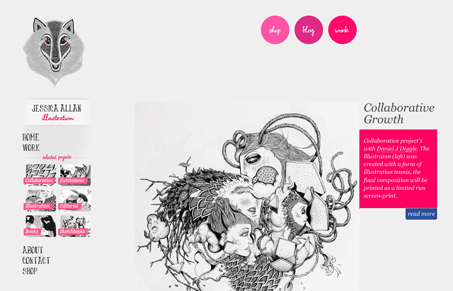
Really simple design, but the illustration work is worth checking out. I love the wolf logo, the eyes! There are some cool little interaction details that make the site deeper than it appears and I really dig the layout where the big image has the box of text flush and to the left like that.




0 Comments