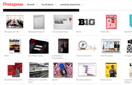
There are things I like about the Pentagram website and things I don’t. The things I like outweigh those I don’t. The way the design focuses on the work first is very nice, it’s totally whey I would come to the Pentagram site in the first place. It helps to draw me in. The sideways scroll bars, while weird and not entirely intuitive at first begin to work fine as you figure it out. However it reminds me a lot of one of those “agency flash sites” from the late 90’s early 2000’s just done up in javascript.
I do think the stark black, white and red make it classy and high brow feeling (classic trio…) Which is the proper mindset for a high end agency like Pentagram. The navigation drives me insane though, it folds out when you mouse over it, but click on it and it disappears. Must fix…
Overall the look of the website is very nice, it’s clean and sharp. The three rows of fixed height portfolio pieces displays the projects in such a stunning array it’s blinding that there’s so much breadth of work to take in.


0 Comments