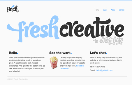
There’s not much to this website, but the design is fresh. I like the color choices and the typeface choice is unique.

There’s not much to this website, but the design is fresh. I like the color choices and the typeface choice is unique.


Large, close targets are faster to hit than small, distant ones, that’s Fitts’s Law. A look at the 1954 rule behind buttons, prime and magic pixels, thumb zones, and dark patterns.

Your working memory holds about four things, not seven. Chunking groups loose information into meaningful units that slip past that limit, the psychology behind phone numbers, scannable pages, multi-step forms, and grouped navigation.

The Call to Action hasn’t changed in a decade, but the bar has. A fresh look at prominence, copy, mobile tap targets, and accessibility, with lessons from three major design systems.
The typeface is excellent. I love it.
Does anyone know which type is it?
the fact that there isn’t much to this site is the best part about it, so may designers feel the need to ‘fill’ there sites up with stuff, this site is a perfect example of the right way to advertise yourself, the homepage even looks like a big banner you’d see on a the side of a bus…
10/10 Finch !
i really don’t like the site at all. the guy totally ripped off finch papers which i believe is a registered trademark. the font is cool but really pretentious. the guy probably submitted the site himself to get attention.
The type is called Candy, available at veer.com
Thank you Erik.