
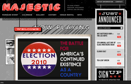
The feel to this website is amazing. I love the type treatment and texture that it carries. Just wonderfuly done. The fact that it’s mostly black/white/gray also really adds to the visual punch. Then the small red items for interactions and call outs really stand out. Great site!




0 Comments