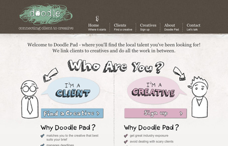
Nice simple layout that makes the split calls to action stand out. The illustrations help guide you to those two points as well. I like the illustrative feel of the site, I think it could have gone farther in pushing that but it’s a well rounded out look for this site in the end.


0 Comments