
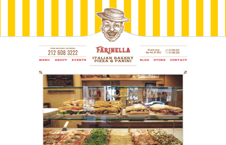
All in all this is a pretty simple website. There’s not a ton of visual “effects” or color, but what’s here is placed very well. Now there are some elements that are graphics that I think could or should have been live text, using some alternate text technique but it doesn’t effect the user’s experience with the site any. Giovanni said the head was a bit creepy, I agree to an extent, I’m not sure, I think it’s just a bit large. But then again it’s really fun that it bounces as you click on the main navigation links. All in all pretty good looking website.




0 Comments