
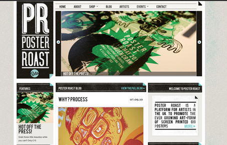
I like the blockiness of this design. The colors and textures really speak to the screen printed medium too. I also like the slight little 3D page fold elements tossed here and there. There are some areas where the type is set full justified and that doesn’t work for me. I don’t think a left justified set of text would really hurt the design any. Just my humble opinion there.




0 Comments