
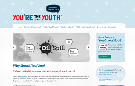
I love the vibe and rhythm of this design. The spacing and readability in the layout are quite nice. I also love the playfulness that the designer has been able to convey with just typography. I’d love to see a little more character come through in the main navigation, the simple approach isn’t hurting the design, just my opinion in what could take this design over the top. Good stuff here!




0 Comments