
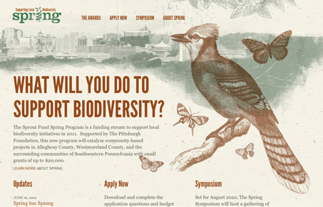
Really beautiful design, with some really great illustrations. I love the textures and the earthy colors mixed with these specific illustrations make this site sing. I’d love to see more variation in the illustrations from page to page, having just these two basic ones removes some of the spectacular-ness from the design for me. Also i’d love to see a tiny bit more hierarchy between the main paragraph font and the rest of the pages’ fonts on the home page. The hierarchy is there in the headlines but just not the body copy.




0 Comments