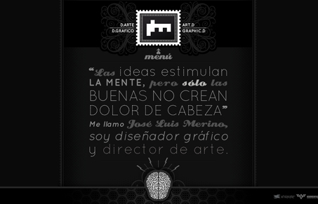
I’m really into the illustrative details in this site design. I’m not wild about the navigation’s interaction, I think a slightly different treatment to how you access it, specifically making it way more obvious to the user, would take this site to the top. Overall the look & feel of this site has a great vibe and tone, love the brain illustration too.


0 Comments