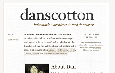
I really like the strong typography in this design. The design grid is simple and the colors are chosen well. The think I like most about this website is the tone of the copy. It’s laid back and very open, yet still retains a formal feeling, like Dan is going to do a great job for you but he’s still going to be human about interacting with you. The call to action really drives that home, it’s just “get in touch”, simple and laid back. I like this guy already!
Glassmorphism: The Transparent Design Trend That Refuses to Fade
Glassmorphism brings transparency, depth, and light back into modern UI. Learn how this “frosted glass” design trend enhances hierarchy, focus, and atmosphere, plus how to implement it in CSS responsibly.


0 Comments