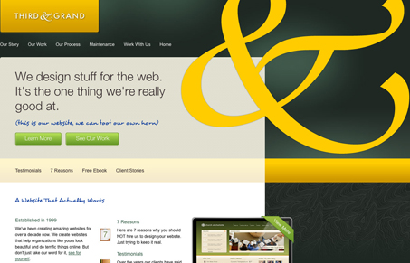
We’ve featured Third & Grand website design iterations before, they’ve always been pretty good. I like this site just the same as their past work. I will say that’s one mean ampersand they have going there, it’s probably got the record for being the biggest on any site i’ve seen. I love the ampersand, so don’t get me wrong. I think the colors and textures are all fairly original looking.
Parts of the site feel sort of flat visually to me though, perhaps it’s because it’s a fairly repetitive layout formula – I think it’s because the ampersand takes up all my attention on each page. In an effort to be constructive though, I’d love it if the large ampersand was only used on the home page and there was a some variety in the layout from page to page. Great design though, it feels brave to me and I like that.


0 Comments