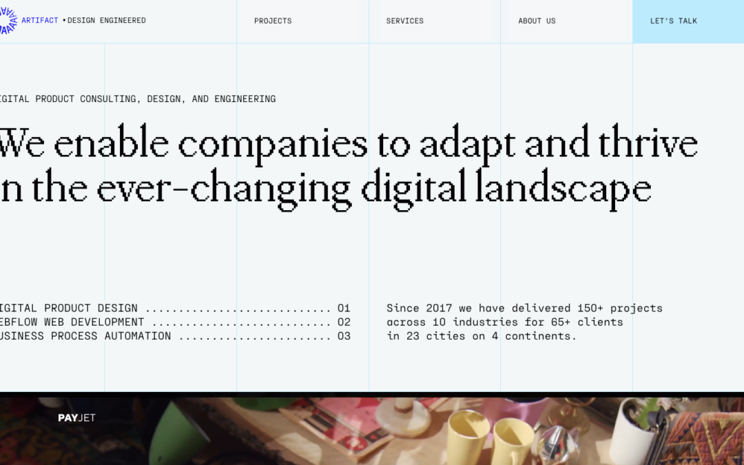
by Gene Crawford | Apr 25, 2024 | Design Firm, Gallery
What’s really cool about this design is the use of 90s-style pixelated fonts and the decorative grid. These elements give us a glimpse into the careful planning that goes into creating their sleek designs. It’s like a mix of old-school charm and modern...
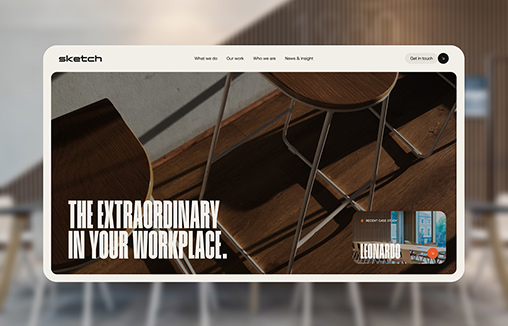
by Gene Crawford | Apr 23, 2024 | Design Firm, Gallery
A new website for Sketch Studios built in Craft CMS: A workplace and furniture consultancy that creates inspiring environments that embody their client’s values and aspirations through sustainable, transformative change.

by Gene Crawford | Apr 11, 2024 | Gallery, Product
Posting this for a lot of the reasons we love those Apple product pages. Just good design and well done copy/ux, etc… Just go enjoy it. 🙂
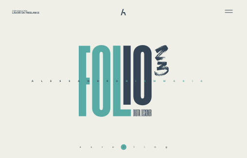
by Gene Crawford | Apr 10, 2024 | Gallery, Portfolio
Personal portfolio of Alessandro Giammaria UI/UX Designer, and logo designer Freelance based in Italy.

by Gene Crawford | Apr 9, 2024 | Design Firm, Gallery
A small team with big ideas. Together, let’s turn ideas into extraordinary designs that leave a lasting impression. We are more than just a design agency; we are storytellers, problem solvers, and architects of visual experiences. Insphic started as a dream...