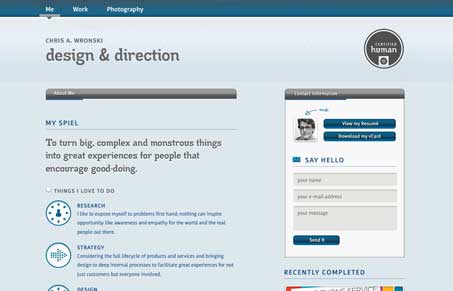
This is a really interesting looking design. It’s definitely a non-traditional layout. I really love a lot of the details like the way the portfolio pieces are showcased in the small wide graphic shape and the icons and things used for each section of copy. I also really love the way the background image down in the footer is treated too, that’s just neat looking.
Brutalism: The Beauty of Breaking the Rules
Brutalism in web design rejects perfection for authenticity. Stark grids, raw type, and honest structure create interfaces that feel human, intentional, and impossible to ignore. Break the rules, on purpose.


0 Comments