
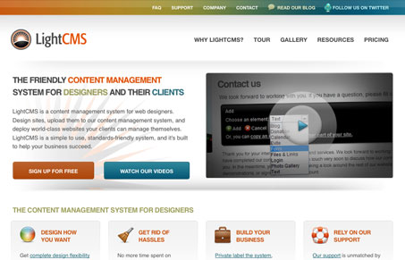
Nice rework of the Light CMS website. It keeps some remnants of the past design’s colors, but this is much more open and utilizes the white background much better I think. It may be a bit heavy on feature listings on the home page but they are designed/treated well.




0 Comments
Trackbacks/Pingbacks