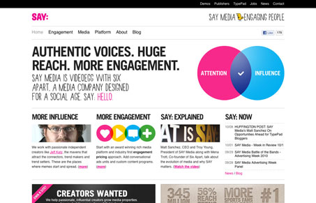
The new Say Media website is really visually striking. Julia and I liked it quite a bit in our screen cast review. The typography is chosen really well to give a nice open vibe. The layout is also very well done and from page to page it’s engaging. We were a little confused at first at the way the copy is targeted but in the end we come to the conclusion that it’s just not targeted at clients that “don’t get it”.


0 Comments