
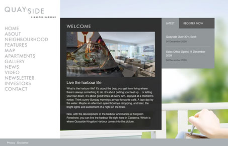
Really crafty website design. Loving the typeface used in the main navigation and the simple clean overall layout. The register form is well placed, I think it could be shorter in the number of fields it’s asking for strategically. I like the use of the fixed footer on this website too. I really like the overall feel of this site, it’s very professional and clean and makes me feel like i’m looking at an architect’s website somehow.




0 Comments