
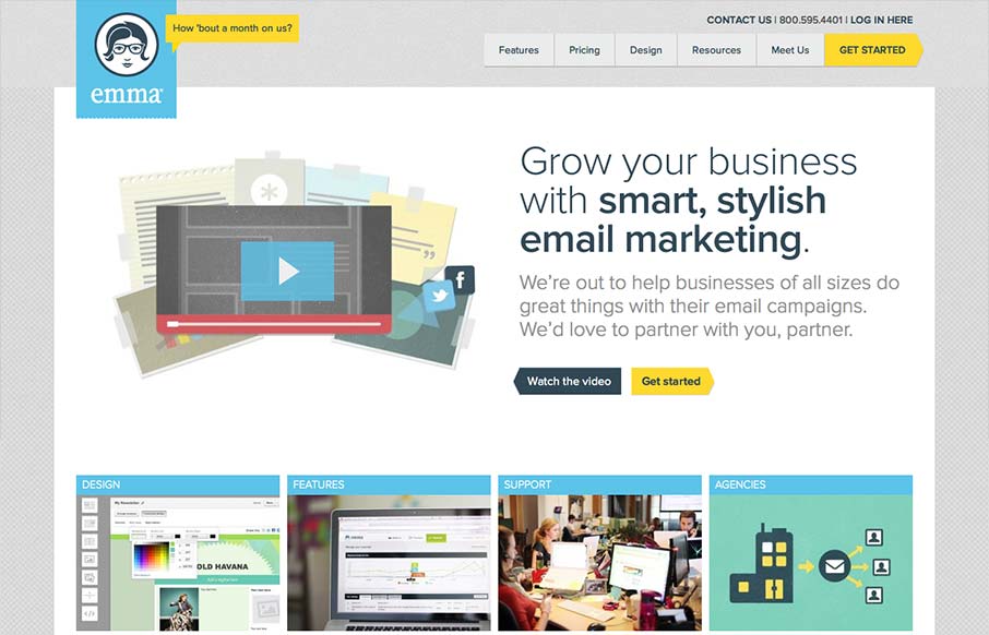
The emma website is very crisp. I dig that top nav and how crisp and brite it looks to me. The “get started” call to action is easy to find and understand and I like that it’s echoed on the page a couple of times. The overall layout gets more dense with content as you move farther down the page but that’s how it should be I think for a product like this.


Chunking: How to Design for a Brain That Can Only Hold Four Things
Your working memory holds about four things, not seven. Chunking groups loose information into meaningful units that slip past that limit, the psychology behind phone numbers, scannable pages, multi-step forms, and grouped navigation.


0 Comments