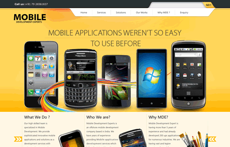
This website is a great example of having almost too much stuff going on visually. Don’t get me wrong I like the design, the colors give it an interesting vibe and the imagery is just sharp. I really like the search box design in the header. Generally though, some visual editing would greatly improve the volume of this site. What I mean by that is, when I first load it, it takes me a while to figure out what this company does and where they want me to look first – and i’m looking for it, most people won’t.


0 Comments