
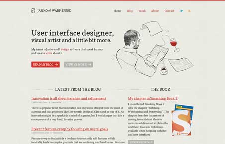
Really beautiful design. The clean typography & easy visual rhythm makes this site super easy to scan. The colors are also expertly chosen to aid in a pleasant reading experience. I also love the illustration on the home page, it’s just enough to give the site character yet leaves it very high end looking. You won’t be let down by the content in the blog here either, really top notch stuff.




0 Comments