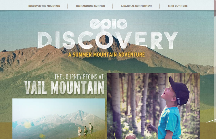
epicdeiscovery.com is a lovely little site with a whole lot of personality. It’s clearly designed to get a user to want to be out in nature and I think it succeeds beautifully. While structurally complex, the content is fairly minimal as are interactions. Each content area is a drop-down from a poster image. The result is a lot of visual activity, but the content is presented in discreet little packages that don’t get in the way of one another.
The main navigation floats above the content as a static bar. While this is no doubt, useful, I do wish it wasn’t quite so translucent. I didn’t even see it for the first few mouse wheel scrolls. Also, the site is very media heavy, which made loading pretty slow on my home connection. Finally, while I like the vertical parallax effects, scrolling is a little hitchy. Its not quite smooth enough to get the full parallax experience.
I do love the branches overlapping content, though. Thats a really nice touch that makes the site feel that much more steeped in nature.


0 Comments