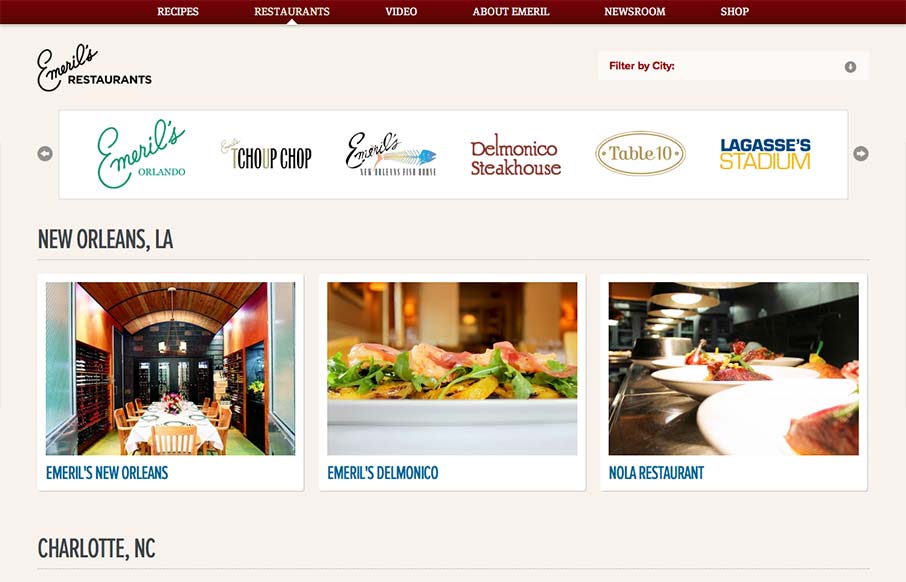
Aside from the oddity of having different sites/URLs in the main nav, the restaurant “site” is really nice. It has a clean design with gorgeous imagery (cuz let’s face it, Emeril’s food is a dream) and a great layout of information. It’s as if each location has its own microsite but they keep the same visual design across all. The site is also responsive with some nice considerations in terms of removing images at smaller screen sizes. There’s a lot of visual weight given to “Emerils.com Menu” on the smaller (say, iPhone width) size. When you’re in a specific location’s microsite, the Emerils.com Menu seems to overpower the more relevant navigation for that restaurant. Really great stuff here though. Now I’m hungry. 🙂


The Call to Action, Revisited
The Call to Action hasn’t changed in a decade, but the bar has. A fresh look at prominence, copy, mobile tap targets, and accessibility, with lessons from three major design systems.


0 Comments