
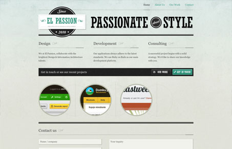
I love the details and simplicity of this website. There’s tons of fine detail work, like in the textures and typography. The content is fairly simple, basically blocks of content move from page to page and are the same on the home page – it’s a nice experience because you instantly figure out what you’re going to get. I also love the portfolio detail pages, just the right mix of project image and write up.



Using IE8 I’ve just been told by the site that I have a “prehistoric browser”. Rather an insult, and I cannot view anymore of the site.
That’s got to be a joke, not sure it’s really all that funny, but a joke none-the-less.