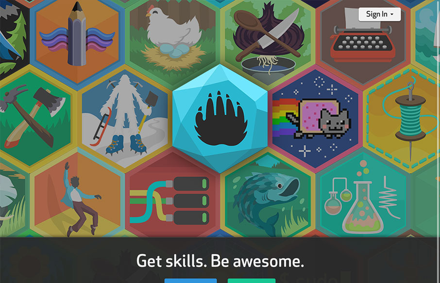
This site is all kinds of interesting. It teaches kids new skills and through the power of social media, it connects them to others that share their interests. Honestly, it looks like a heckuva lot of fun for any age. The design is solid – with 3 streamlined paths you can jump in to right away. I like that they added function into the large hero banner too though. It adds a tad more dimension to browsing around. The illustrations are fun and colorful and do a nice job of leading the overall aesthetic of the site. I haven’t checked out the mobile app yet, but if it’s anything like the site, it should be well laid out and easy to use.


The Call to Action, Revisited
The Call to Action hasn’t changed in a decade, but the bar has. A fresh look at prominence, copy, mobile tap targets, and accessibility, with lessons from three major design systems.


0 Comments