
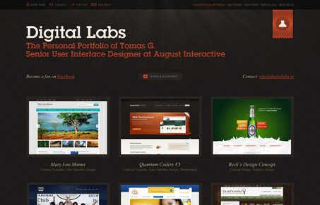
This website doesn’t beat around the bush, it’s straight forward portfolio. I suppose that’s just as effective as a full out site. What’s nice about this is it’s not just a single page job, the work samples have their own dedicated page with plenty of detail. The look and layout is top-notch too with that nice slab serif typeface and coloring choices mixed with an ever so slight gradient/texture. I also dig the footer, it’s almost out of place but really compliments the overall earthy feel to the rest of the site.




0 Comments