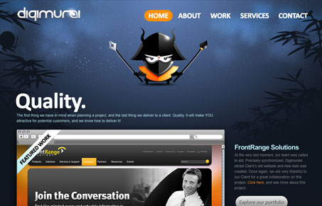
I like the “theme” aspects to this design, the naming and the samurai angle worked throughout in the background and especially in the logo are clever. The layout of the home page is very clean feeling even though the background and illustrative logo are on there in such a large header space. The big bold buttons for all the call-to-action spots stand out really well. I think the portfolio navigation falls apart within the design a bit, the big squared iPhone looking icons detract from the rest of the site a bit.
Monochrome Minimalism
Monochrome Minimalism merges Bauhaus discipline with IKEA simplicity. Clean grids, muted tones, and functional beauty create digital calm, proof that restraint, not decoration, defines timeless design.


0 Comments