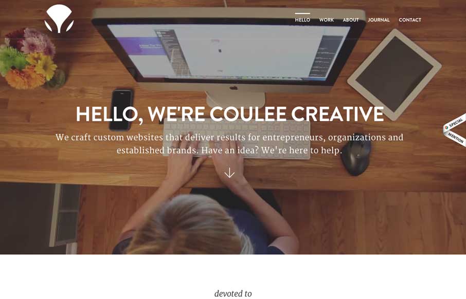
I feel like the Coulee Creative site uses what’s become a fairly standard formula for a client services website layout. However, I like this one as an example of how to do it and keep it clean and interesting. This site is deep content wise and gives you enough info to feel like you know there are humans behind the company. It’s also quite well done and seems like a solid build too.


The Call to Action, Revisited
The Call to Action hasn’t changed in a decade, but the bar has. A fresh look at prominence, copy, mobile tap targets, and accessibility, with lessons from three major design systems.


Thanks Gene for the warm review!