
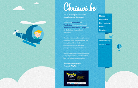
Fun little illustrations can really make your website shine, in this case it’s what makes it go entirely. The site itself is really simple in design and execution, there’s not much else going on here other than the illustrations. That’s okay though because it’s cute and really nicely done. I’d love to see slightly different illustrations on each page of the site, it does get monotonous as it’s the exact same on each page so the depth that was created from the initial viewing get’s lost after the first click. I think that would take it from being a good looking site to a really great site pretty quickly.



0 Comments