
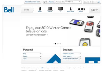
Website for Bell Canada. It’s really clean and minimal and uses javascript in really helpful ways to keep the visual design simple looking. The image slideshow for the various marketing initiatives is really standard but a really central part to this design. Along with the little interactions in the bottom marquee areas there’s more to this site than first glance. This is interesting since the audience for this site has to be really wide open and presumably not as sophisticated as you’d think to throw all these interactions at them. I like that, pushing the limits with what you can do with a site like this, bravo!




0 Comments