
This article is based on a talk that I recently gave to our local Refresh Columbia monthly meeting. Most of the ideas i’m going to share here aren’t mine. I read a lot of books about website design & development and three of my favorites that relate to this idea of sign up form design are:
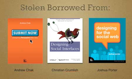
Submit Now by Andrew Chak, Designing Social Interfaces by Christian Crumlish and Designing for the social web by Joshua Porter. The concepts they’ve pioneered have helped me tremendously and the knowledge i’ve gained from their hard work has made me a better designer. Which is why I want to share what i’ve learned with you.
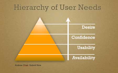
In Submit Now by Andrew Chak, we learn that users have a set of needs that must be met, Availability, Usability, Confidence & Desire. I’m going to mainly focus on Confidence and Desire. Let’s face it Usability and Availability should be a no brainer for website designers like you, so i’m going to consider those a given as we discuss this topic of sign up form design.
Abraham Maslow (psychologist) said that human motivation is based on a desire to meet a hierarchy of needs. People will take care of basic things like food and shelter before they concern themselves with other higher level issues, like being liked and having self-esteem. The same is for the web. Meet the fundamental needs first then go for the transactional/higher-level stuff.
Seven Principles to Remember
Andrew Chak points out 7 principles we need to keep in mind when designing anything, be it an entire website, a single submit form or a simple call-to-action. I’ve pulled out just a few to help solidify our approach when thinking about conversions on our sign up form:
- Your competition includes your Competitors’ web sites, the web & the offline world
- You must earn the right to transact with the user
- Anticipate mistakes and variations ahead of time
- Either you do the work, or they will
- Help your users do what you want them to do
The user’s state of mind
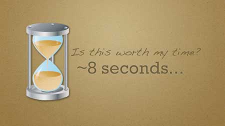
You have roughly 8-10 seconds to get the conversion (that’s not scientific by any means, but it’s a widely accepted metric among web designers). So the moment of signup is the most critical. You’ve spent all this time informing, enriching and convincing a visitor to signup for your service or app but you’ve already used up most of your 8 seconds doing so. Don’t screw it up with the form design right?
What are users thinking?
 When we are envisioning and designing our website or app we typically think of our target user as being an astute, optimistic person who is familiar with us and looking forward to using our services. In short we assume they have some level of “desire” to get past our sign up process. What they are actually like is usually totally different than what we expect.
A great example of what users (in general) are really like is in the “Read Write Web Incident”. If you missed it, what happened was really eye opening. A very large number of users tried to log into a blog, that they got to by entering “Facebook Login” into Google, using the Facebook Connect login button on the blog and thinking that this was actually logging them into Facebook proceeded to make hundreds of comments about how the blog itself wasn’t Facebook. I suspect this happened on several blogs and actually happens all the time. For me this was funny but also an eye opening experience to witness as it unfolded in the blog’s comments.
Things to think about
These few tips on designing the sign up experience on your website are also the basic outline for Joshua Porter’s book designing for the social web. He has a lot of other very important info but I think these few really help the process of specifically thinking about the sign up experience:
- Describe WHAT it is
- Show HOW it works
- Show the end result
- Explain WHY
- Give examples of WHO is using it
- Use Testimonials or Case Studies
- Get Specific
- Give numbers (when they’re big-ish
I’ll show you several great examples of sign up forms using these practices to their fullest:
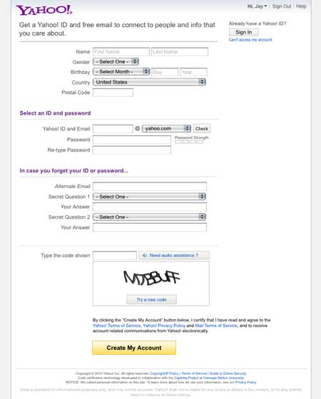
Let’s start with Yahoo.com’s account sign up form. It’s a good example of a well engineered form, though it may be lacking in sexiness it makes up for it in being thorough. It has a lot of auto-complete functionality like on the personal account naming field. Let’s keep this as a sort of good baseline to compare other forms to.
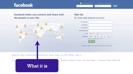
Facebook’s form is clean and simple to use, you can complete this form in a flash, simply by limiting the fields it takes to get you into the app. They also do something nice with the graphic by showing you the concept of connecting with people you know all over the world.
Twitter.com & Gowalla.com
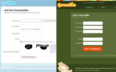
Just the basics on these two sign up forms. They ask just enough so you can engage in the community right away. Too bad Twitter has to guard against spammers, the captcha is a big roadblock on this otherwise beautifully simple signup form.Like Twitter Gowalla’s form is extremely simple to signup and get going with the service, I suspect the fact that it mimics Twitter’s form fields is related to the pairing of Gowalla and Twitter. However once you sign up you can then elect to use FacebookConnect making it that much quicker to get in on the fun. We’ll look much closer at FacebookConnect later on.
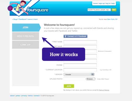
A more complicated sign up experience for the same basic functionality as Gowalla. Apparently using Foursquare is a multi-step process as denoted by the tabs on the left, which is a really great way to inform the user of what’s expected, where they are in the process and how much is left until completion. This is an extremely easy way to show “how it works”. Of course they also throw out the life preserver with the Facebook connect option.
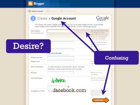
One of the earliest free online services to really be huge. The sign up form for Blogger is a multi step process and quite confusing to scan visually. It’s almost pretty, but from a pure user standpoint, this form probably takes people quite a while to complete with several back-and-fourth actions. I think Blogger must have a pretty high level of desire for users to get an account because it’s so widely recognized and there’s already a ton of people using it.
The things I find most troubling here is the fact that getting a Google Account is the first step in the process, the header is very confusing “Create a Google Account” – I thought I was signing up for Blogger… The submit button isn’t necessarily a strong button shape, an arrow while suggestive that there’s more to go might not exactly stick out as a submission button. The gradient behind that first form field is also out of place, you’d assume that it will follow you as you tab through the fields, but nope, it’s just static, always at the top.
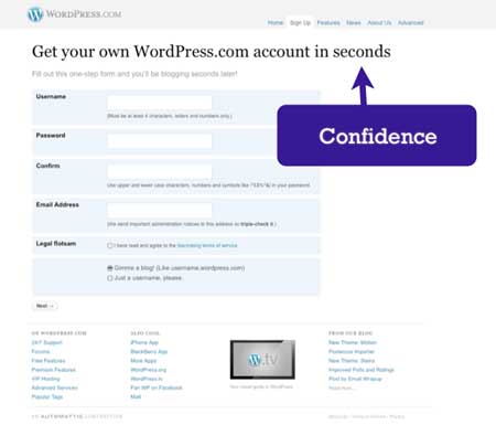
Comparing WordPress to Blogger is day and night. WordPress’ form is clean and simplified, I know there’s going to be more after this form but they’ve stripped it back to ensure I can at least get setup with an account as quickly as possible. They also give you a strong sense of confidence with the header “Get your own WordPress.com account in seconds” tells me all I need to know.
Posterous & Tumblr
There’s a lot of talk about whether Posterous’ email signup is a “Tumblr-killer” feature. Some people really dig it others have been pretty critical about it. My opinion is that it’s not really a “killer” feature, that it’s not something that will truly set it apart from something like say Tumblr. I’ll take a well designed app over a well engineered app any day when it comes to betting on conversion rates.
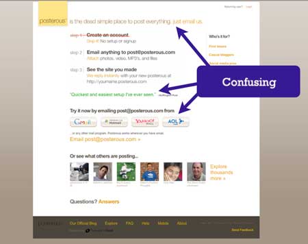
With Posterous all the user needs to do is send the app an email and whammo you’re off to the races blogging. The thing is the header “posterous s the dead simple place to post everything. just email me.” isn’t all too compelling or convincing. First I don’t exactly know the how or what to do here. Second those email logo/buttons don’t really do anything, they link off to the email service’s login pages, that kind of throws the user off the scent of what you want them to do. Counterintuitive I know, but getting someone to go out of the browser (the site you’re on) then doing an action away from the site to create a new post just doesn’t seem so simple a process to me. I have a Posterous account and I can attest to how cool it is, this sign up process just needs to be tweaked considerably if they want to get it past only having web savvy users using the service.
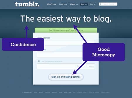
Here they’ve made this so quick and easy and beautiful. How can you help not signing up for this service? Tumblr just exudes confidence with it’s header “The easiest way to blog” in giant bold lettering. The form is also informative, the URL field contains the info you need to see where you’re blog will be located, by typing it in you learn how it works. The submit button is also smartly worded “Sign up and start posting!” tells me that this is the first and final step to getting an account. Click this button and i’m good to go. Tumblr will also continue to engage you after the point of signing up to complete your profile and start posting. A concept Christian Crumlish describes as “onboarding”.
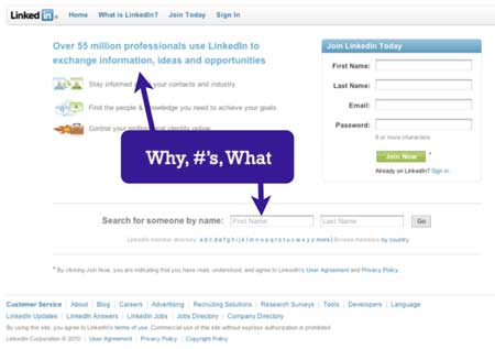
Aside form having an extremely scaled back and simple sign up form LinkedIN has other great convincing content on the page. They tell you how many users (35 million wow!) and they also let you see other users in the system, people you probably already know.
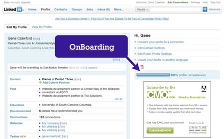
What LinkedIN does best though is the onboarding. Let’s define onboarding as: serving up things for your user to do after they’ve logged in to finish their profile, interact with other users or whatever it is you want them to do. LinkedIN gives you a sort of thermometer or graph showing you how far along the process of completing you’re profile you are. They also display this publicly to other users, compelling you to get to 100%.
It’s all in teh details
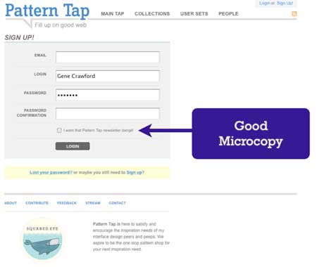
Patterntap.com is a website created and run by Matthew Smith of Squaredeye.com. What’s great here is the microcopy (something Joshua Porter is really into right now). “I want that pattern tap newsletter dangit!” is simple and funny, gives me insight into the website’s personality. It’s also a very clever place to get the opt-in you want for a newsletter.
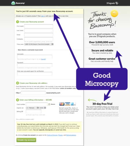
37signals’ legendary web app for team collaboration. I’m breaking the rule that i’m only looking at free apps with this post but it’s a really great example and deserves to be studied. Something that is very smart is they remove all other links from the page, have selling points on the page, point out the 30 day free trial, the list of best practices here goes on and on. This is a fairly common design pattern on many paid for web apps. But it’s also something that many for free apps do as well in one form or another.
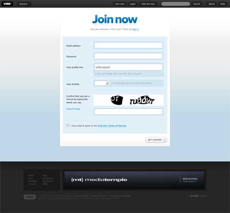
One of the more beautiful signup forms i’ve ever seen. The only links on the page are in the top navigation bar and are very minimal when you are on this page. They do have the captcha which can really work against you in conversion speed – but it’s probably a requirement for them due to spammers.
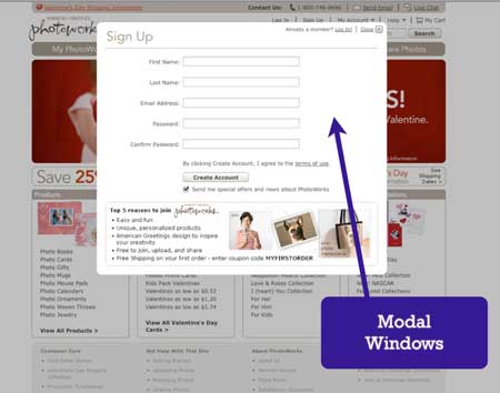
The use of a modal window is also pretty common for signup forms. They effectively remove all other links from the sign up page. However you have to be careful, if you allow it to close out by simply clicking off the highlighted window area, that could spell disaster for your conversion rate.
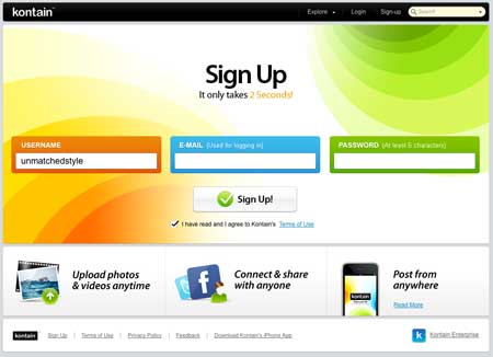
They’ve really simplified the form down to 3 fields and designed them horizontally aligned across the page. I’ve not seen a form design like this and in my opinion makes the form look incredibly simple. I’d love to look at the conversion rates on this form to see the design’s true effect.
Facebook Connect

The reasons for using Facebook Connect are compelling, starting with the numbers alone:
- 60 Million users a month use Facebook (link)
- 30-200% signup increases (link)
- 15-100% increase in participation & engagement (link)
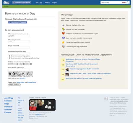
They throw the Facebook Connect button right at you when you hit the signup page. I’ve recently re-started using Digg at least once or twice a week since they did this, where previously I would forget about them. Overall the form/page is fine, the extra info on the right hand side could help convince a user that Digg has something to add to their daily web use in having a Digg account.
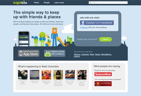
They believe in Facebook Connect so strongly that it’s the only visible option to getting an account on the home page. Though if you want to sign up using a traditional, and very simple, form you can.
Random Stuff
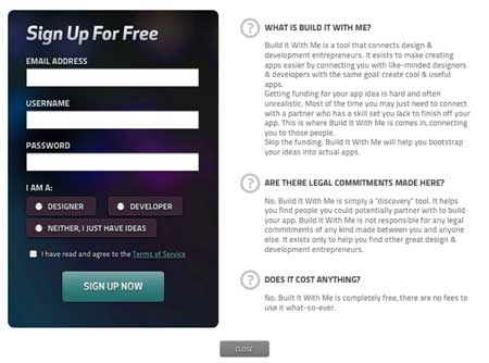
Builditwithme.com has a section where they want you to classify yourself as a “designer, developer or just a person with an idea”. This can be a clever way to begin to have users begin their profile configuration, especially if fitting into one of those categories will effect their experience using your app.
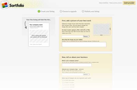
The sing up form is also the configuration form for your account. This is a rather clever form, with elements that follow you as you scroll and display how your ad looks as you complete the process.
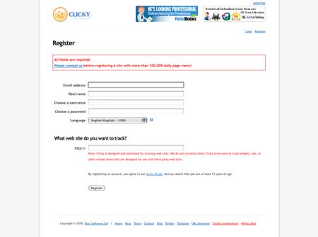
Nice simple form, but why is the extra information messages designed in red? It looks like i’ve caused an error with my submission before i’ve even clicked “register”. This is probably not a good idea.
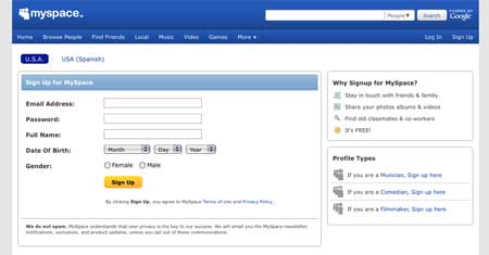
Otherwise known as home of god-awful websites, Myspace sports a sign up form that’s almost just like Facebook’s. The form itself is rather simple, but the profile types off to the right hand side are pretty confusing. What other types of profiles are there? I’m not a musician, comedian or filmmaker (those are static too…)
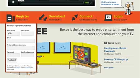
While the drop-down element seems to hang with you after you open it, i’ll let you figure out why generally putting your sign up form in a drop down element isn’t a good idea.
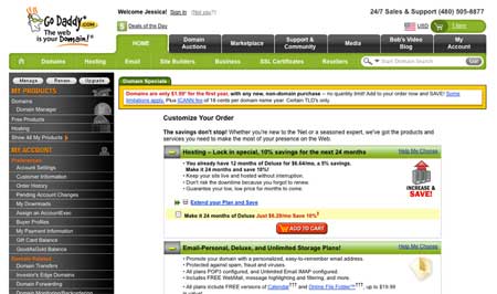
Godaddy uses most of the best practices we’ve seen so far, as well as every other practice known to man since the internet was invented. There’s so many shiny objects to lose your way on this home page, I find it hard to believe that they have any conversions at all.
The Godaddy signup page is like 6 or so screens long and there’s a submit button that does something other than actually submit your order every 1/3 screen down the page. How people complete this form at all baffles me. There’s likely a very huge sense of desire on this site because of the cheap domains and decent level of service known across the internet. Then again it could just be Danica Patrick that get’s people to sign up. But I digress…
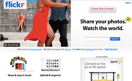
Flickr has millions of users, a huge database of images you can sort through and is generally considered one of the top apps on the web today for having a great experience from top to bottom. What I don’t like is the idea that you are confronted by the Yahoo.com account setup page the moment you click the “create your account” button in the top right of this site.
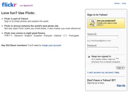
The fact that you’re shoved directly at a Yahoo.com ID creation screen is likely off-putting to many new users, particularly new web users. If you don’t have a Yahoo ID you can’t play. Using a Yahoo ID may make you want to scratch your eyes out if you don’t actually use anything else but Flickr too. (Sorry if I offend, but it’s true…)
So that’s my round up of sign up form design practices, patterns and good/bad examples. Hopefully you’ve learned something if you’ve stuck around until the end of this article or at least are left with some idea of how to improve the next sign up form you work on.


Excellent points. Although, I do see logging in or signing up becoming obsolete. As Facebook, Google, and Twitter have tried to do, I think we will have one account that logs us into everything.
Sign-ups are a pain!
I’m looking into implementing forms on my website and these have been really helpful, thks!
I agree to a point Scott. You may be right in the long run, but it feels like that would be many years from now to me.
@Scott whilst the principle initially sounds like a huge saviour on time, this is something I’d never use.
If someone managed to get access to any of your accounts they’d also be getting into things like paypal, My Google account or even my on-line banking!
There must be a flow maintained a well thought and segmented form works always. And the other thing that I like, is to give some idea to user that in how many seconds and steps he might be able to complete his forms this brings in interests. Because it creates excitement, Every user one want to be quick with filling forms, so there is no room for complex, keep it as simple and clean it can be else it become frustrating and you loose.
Love this Brian.
This has been great seeing as though I have been having to design some “Join Us” forms. Thanks for all the great tips!
Charles
@Gene, I do agree with you, although, we may not have a choice. It may get to the point where we, as a society, are so impatient that we will fall victim to have a universal login…bummer…
you are so right about flickr, a great UX besides the registration and login
Very nice post, thanks 😉
No mention of the integrated sign up & login that’s been getting some attention from ui folk. (google, amazon inc.) Any thoughts on that?
Great collection of screenshots and commentary. I especially like the Tumblr signup form.
Great collection & nice post. Short sign up form will always useful to attract more people. I love Facebook.
very comprehensive explanation of form design! great job sir
Nice article. Thanks
Glad you added GoDaddy. That is the most friggin’ complicated website I’ve sever seen. I always hate going to it. It bombards you with so much noise. I need a pocket map – and a damn good memory.
Yeah, Godaddy has always confused me as to how their form page is actually successful. Maybe it’s just a result of cheap domains?
A good summary of the topic, thanks for your hard efforts. Not heard the term ‘Onboarding’ before either, spot on.
Nice read! As I am struggling (to be honest) to increase the conversion this article has given me some solid pointers.
1 question for everyone: Does automated Sign up process (collecting email id and mailing welcome note and password) beats the traditional Sign up process in the long run?
Excellent post, thanks for this
first post ever I read someone analysing the sign up form.
good effort
Looks like you have the wrong link for BuildWithMe. The correct one is: http://www.builditwith.me/
Comprehensive analysis. I see a trend towards a minimilast approach / look. I guess as we keep speeding up, we are looking to cut through the red tape.
@Scott: agree with you, else the facebook and twitter connects wouldn’t be accepted, nor be so successfully implemented
Awesome .Very Nice even i never consider those factor can help a lot from ui point of view .gr8
i really like your article. presentation of the design is critical to usability and adoption. but it is also important to create a legitimate contract. take a look at this demonstration of the msn.com contract. http://www.profitandlaws.com/2011/07/a-great-example-of-an-agreement-acceptance-page/
“principles”, not “principals”
We went for a super-simple yet whimsical design for our free account signup page over on introduction.io – reviewing the membership features and including a fun illustration: http://www.introduction.io/user/register
Pretty useful form design tips, I would also like to see a post on multistep form design.
Thanks for sharing a variety of sign up design.. Awesome…
Great article! Needs some proof reading… a few typos here and there, otherwise good stuff!
Large sites keep changing their sign up pages. I have noticed twitter, they do A/B test to increase their conversion rate.
Thank you very useful post !
Highly energetic article, I enjoyed that a lot. Will there be
a part 2?
please note that Erin Malone co-wrote Designing Social Interfaces with me (and thanks for the shout-out)!
Great Article, thanks for sharing.
This design is spectacular! You obviously know how to keep a reader amused.
Between your wit and your videos, I was almost moved to start my own blog (well,
almost…HaHa!) Wonderful job. I really enjoyed what you had to say, and
more than that, how you presented it. Too cool!
That is the design due to which it has become possible for us to reach space and conquer the new unknown ways for the betterment of the mankind so that more and more studies can be conducted to provide the best sources to our students.